PanicSlideButton
Two-state PANIC control: button → slide-to-unpanic CAPTCHA.
| Declared in | src/libs/libwidgets/node/PanicSlideButton.hpp |
| Inherits | QWidget |
| Group | widgets |
Detailed description
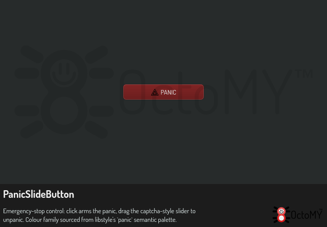
Idle state: renders identical to a normal red PANIC button — a single QStyle::CE_PushButton draw with a red palette, the panic SVG icon, and the literal text "PANIC". Single click arms the panic.
Armed state: same widget rectangle, but the button morphs into a slide-to-confirm track: - The background is a sunken (pressed) QStyle::CE_PushButton in a darker red, with the text "drag to unpanic" rendered on it. - A normal-button "handle" sits on top, draggable left↔right with the mouse. The handle wears a grab-grip icon. - Dragging the handle past the right edge → emits `unpanicked()` and snaps back to Idle. Releasing before the end → handle animates back to the left rest position; the panic stays armed.
The intentional friction (you can't accidentally undo a panic with a stray click) mirrors industrial E-stop reset conventions and the CAPTCHA-style "slide to verify" pattern users already know.
Painted entirely through QStylePainter — no setStyleSheet, no custom-paint chrome, so the widget adopts whatever theme the host app is using.
Property documentation
handleX property
handleX : int
This property holds the left edge of the slide handle, in pixels from the left edge of the widget.
The value is between 0, the rest position, and the widget width minus its height. A write clamps to that range. The armed track fades its text as the handle moves right. The snap-back animation drives this property to return the handle to 0.
Access functions:
inthandleX() constvoidsetHandleX(intx)