OpalButton
Bare-glyph OPAL status + chat-toggle header button.
| Declared in | src/libs/libopal/opal/ui/OpalButton.hpp |
| Inherits | QAbstractButton |
| Group | libopal |
Detailed description
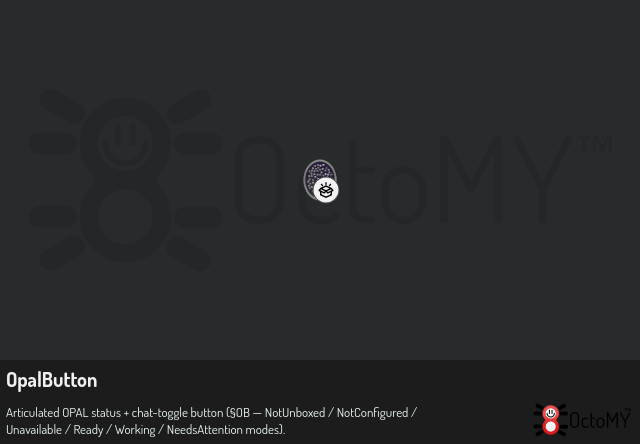
Replaces the old OpalChatToggleButton. The button surface conveys OPAL's pipeline state via the articulated SVG asset at :/opal/opal_articulated.svg (§OB-3 / §OB-A): a tall oval shell with ~70 sparkle dots partitioned across 5 phase-clustered color groups whose colors cycle to fake a disco-ball displacement effect. The asset's geometry is read once and painted with QPainter; only the colors are computed per frame.
The clicked signal still toggles the OPAL chat overlay (left-click, unchanged from OpalChatToggleButton, see §OB-5). The status feed comes from OpalStatusContext supplied via setContext().
No button chrome — the icon paints directly onto the header background (§OB-2 bare-glyph treatment, §AH-3.4 visual rhythm). Sized via Typography::headerButton() (§AH-3.5).
See also OpalStatusContext, OpalChatOverlay.