IdentityButton
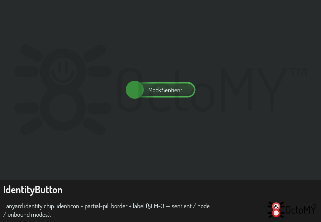
Lanyard identity chip with identicon + partial-pill border + label.
| Declared in | src/libs/libwidgets/widgets/identity/IdentityButton.hpp |
| Inherits | QPushButton |
| Group | libwidgets |
Detailed description
Custom paint implementation of the §LM-3 identity button visual:
* **Identicon** anchored to the left, rendered at full height — slightly *taller* than the button shell so it protrudes above and below. * **Shell** with a **right-half-only** stroke: the border starts fading in roughly at the identicon's centre and renders solidly around the right edge, ending in a pill-shaped semicircle. * **Label** to the right of the identicon, single-line, ellipsised when the configured maximum width is hit (default 160 px). * **Identity colour** — green for sentient, blue for node, light grey when unbound. The colour drives the border; the shell interior is the header background. * **Unbound state** suppresses the label and shows a placeholder silhouette icon in the identicon slot.
The class is identity-agnostic: callers (Lanyard) own the mapping from sentient/node identity → colour and identicon. The button stays a QPushButton so it inherits standard focus rendering, Tab/arrow navigation, and Space/Enter activation.
See also Lanyard.